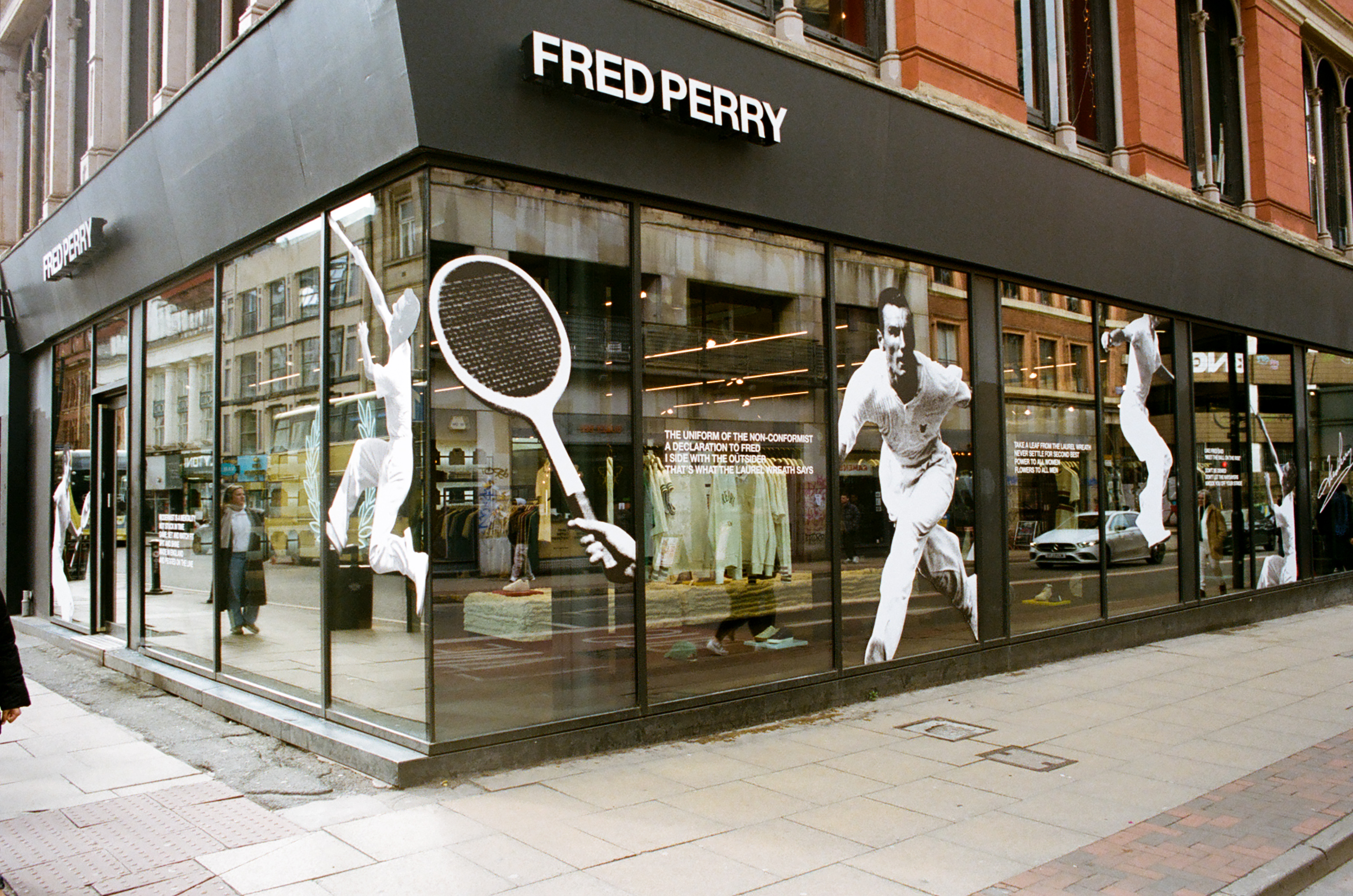
For Fred Perry’s store designs, I wanted to move away from the usual window displays and bring a fresh, dynamic energy to the space by celebrating the latest ‘Match Fit’ campaign. Using images from the archive at Head Office, I carefully cut out photos of Fred Perry playing tennis and played with the composition to create a bold, layered display. The aim was to inject a sense of movement and excitement into the store environment, offering a more vibrant, engaging experience for customers.
The collaged cutouts of Fred Perry were paired with mantras from a poem by British writer John Joseph Holt, adding depth to the display. Rooted in celebrating heritage and tradition, the campaign highlighted Fred Perry as both the face of the brand and a celebrated tennis champion. Placing him at the center alongside the campaign stars felt like a natural way to honor both his legacy and the modern spirit of the collection.


Adding an element of fun to the classic shots of Fred Perry playing tennis felt like the perfect blend of tradition and modernity. The dynamic movement in the imagery not only refreshed the window displays but also provided an opportunity to educate store visitors about the brand’s history and the origin of its iconic name.
Each image was hand-cut, scanned, and digitally altered to mimic the vintage editing style of printed media from the time. I wanted this approach to not only reflect the brand's rich history and the era of the images but also offer a subtle yet engaging way to connect with a modern audience. The image below is taken from the Manchester store.