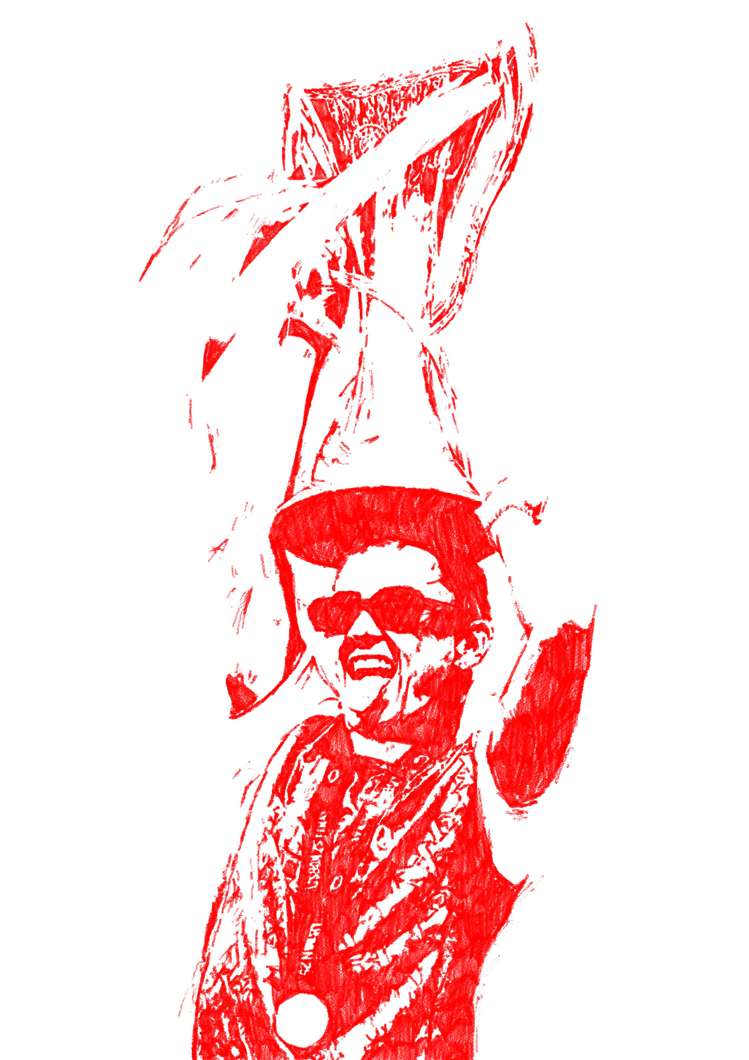
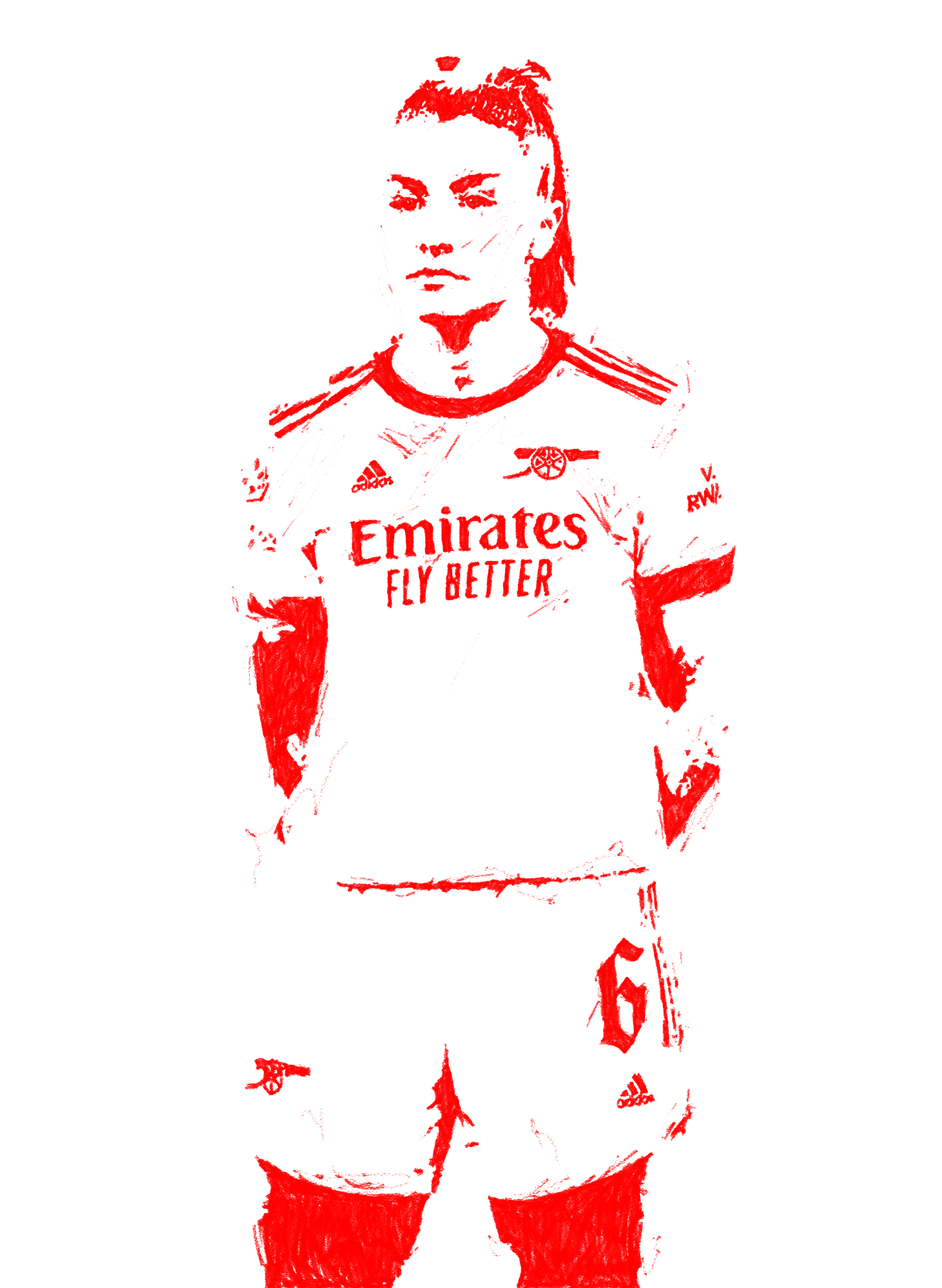
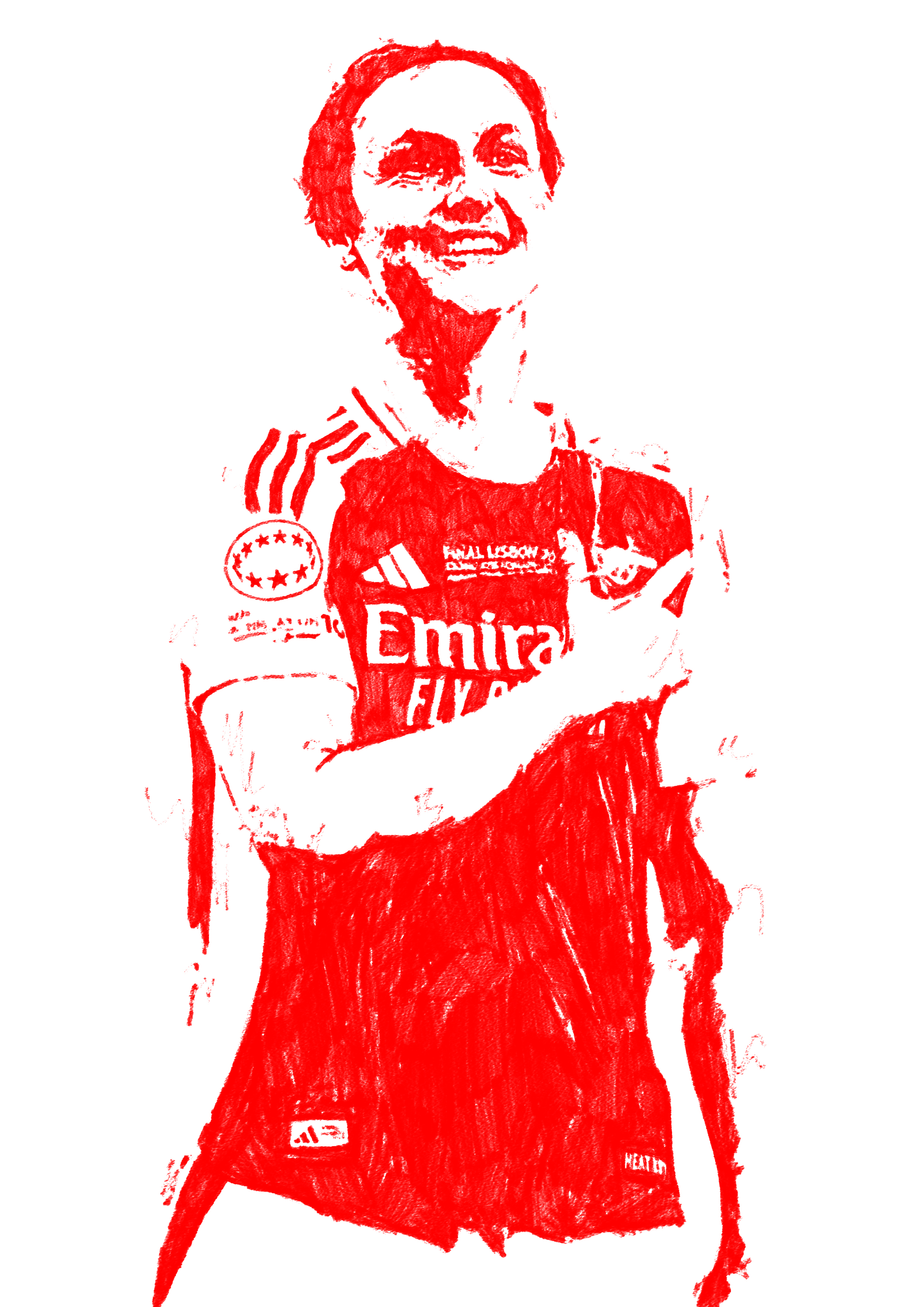
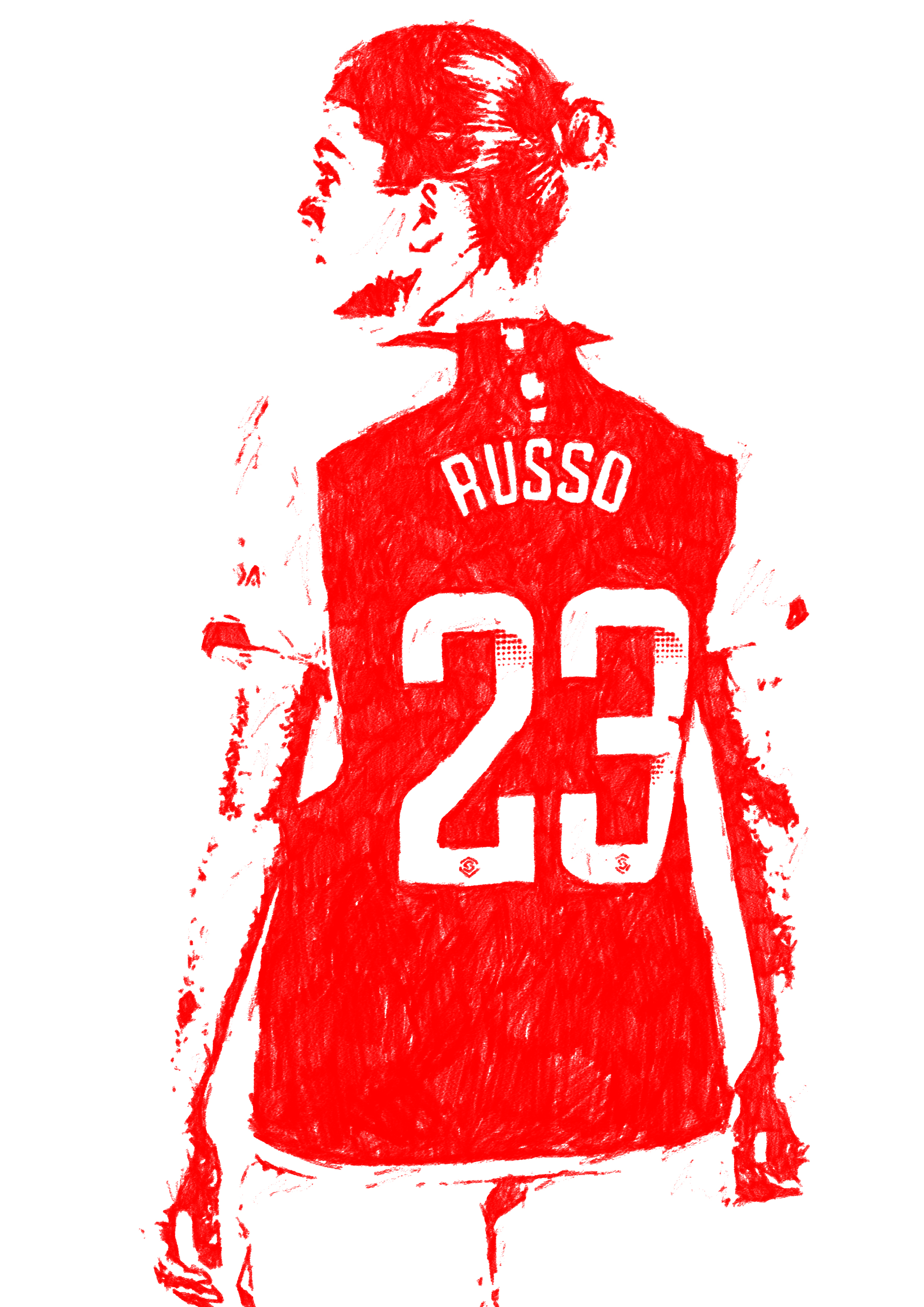
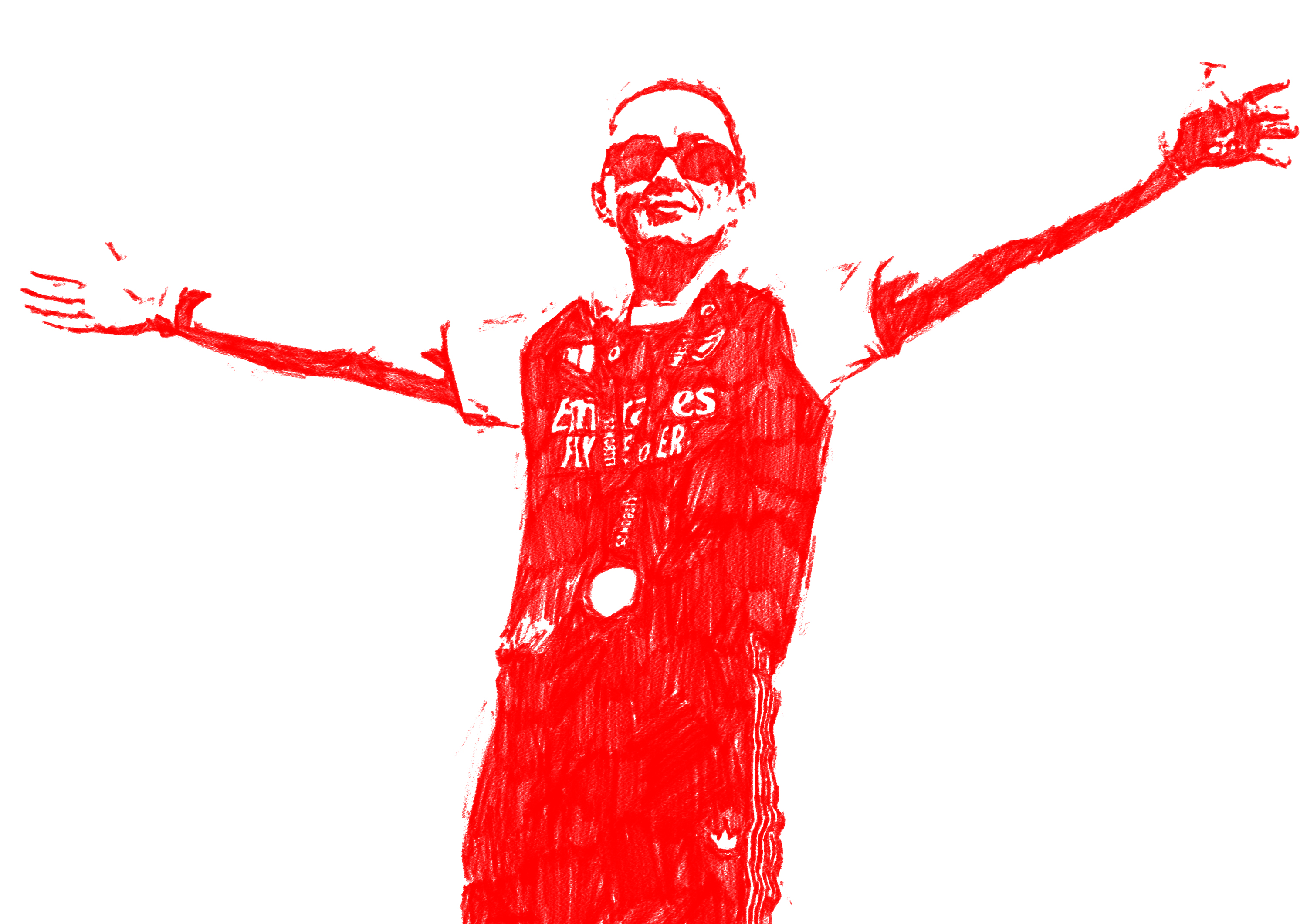
Commissioned by WEIRDO Agency, this project involved creating a series of illustrations of Arsenal Women’s players for their highly anticipated derby match against Chelsea on November 8th.
As a lifelong Arsenal supporter, particularly of the women’s team, it was an incredible honour to contribute to a project that combined two of my greatest passions—art and football. The final illustrations were printed as flags and displayed in the home end, waved by fans to celebrate and support the team.
As a lifelong Arsenal supporter, particularly of the women’s team, it was an incredible honour to contribute to a project that combined two of my greatest passions—art and football. The final illustrations were printed as flags and displayed in the home end, waved by fans to celebrate and support the team.
This collaboration aimed to capture the energy, pride, and unity of the Arsenal community while showcasing the creativity that exists within its supporters.
It was a unique opportunity to see illustration play a role in amplifying team spirit and connecting art with sport on such a meaningful stage. Illustrations feature; Alessia Russo, Leah Williamson, Lotte Wubben-Moy, Katie McCabe, Maria Petri.
It was a unique opportunity to see illustration play a role in amplifying team spirit and connecting art with sport on such a meaningful stage. Illustrations feature; Alessia Russo, Leah Williamson, Lotte Wubben-Moy, Katie McCabe, Maria Petri.


For the launch of Fred Perry’s new store in Amsterdam, I designed a series of out-of-home flyposters that went live across the city in Summer 2024. Drawing inspiration from the iconic heritage Black Champagne colourway, I developed a visual language that pays homage to the brand’s legacy. Using carefully selected archive imagery of Fred Perry himself, combined with authentic quotes, the campaign evokes both the spirit and style of the brand’s roots while creating a bold and contemporary street presence.
This collection of flyposters was designed to feel both nostalgic and modern, bridging Fred Perry’s storied past with its ever-evolving future.
Below are the final designs that went to print in Amsterdam.
Below are the final designs that went to print in Amsterdam.


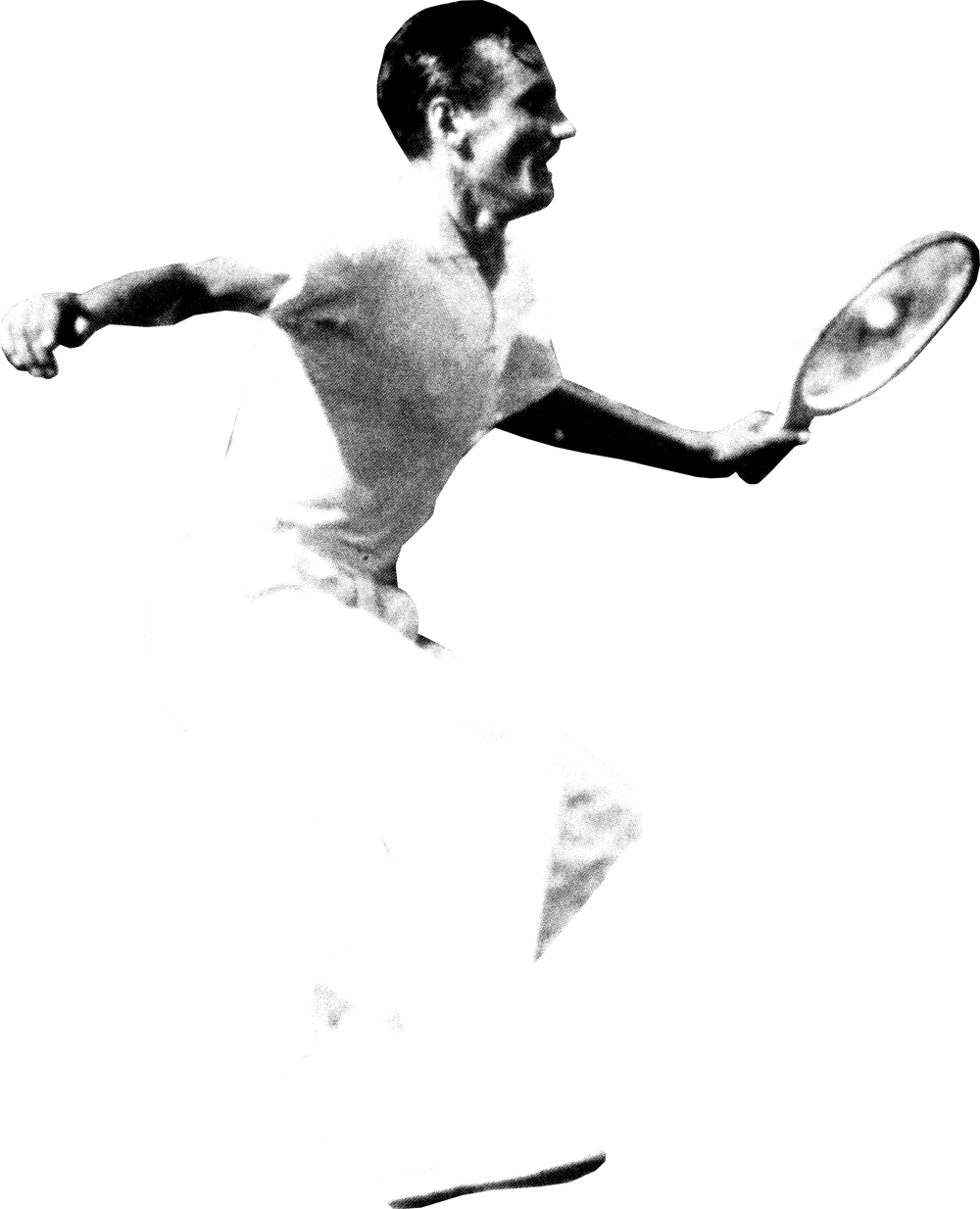
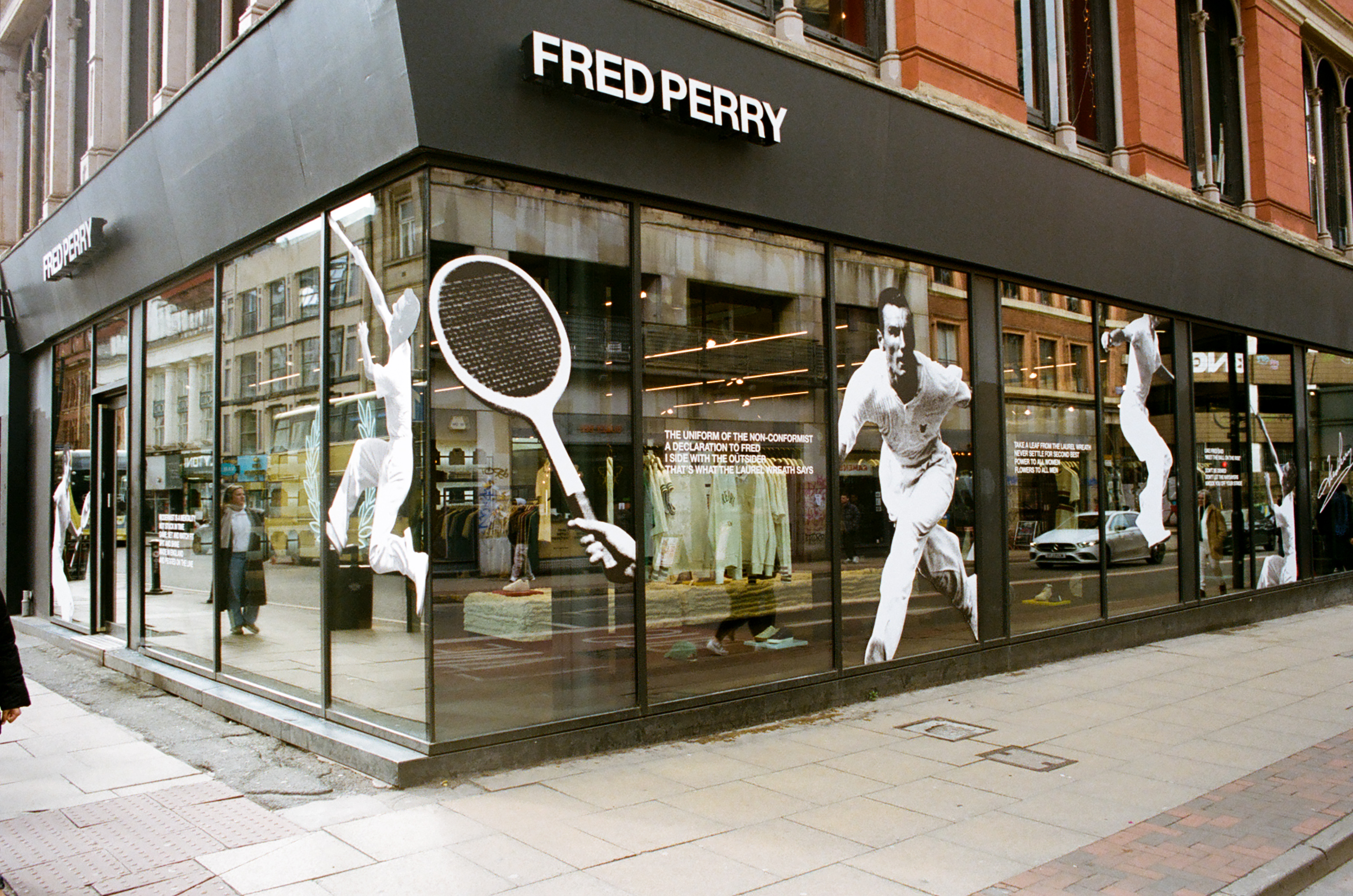
For Fred Perry’s store designs, I wanted to move away from the usual window displays and bring a fresh, dynamic energy to the space by celebrating the latest ‘Match Fit’ campaign. Using images from the archive at Head Office, I carefully cut out photos of Fred Perry playing tennis and played with the composition to create a bold, layered display. The aim was to inject a sense of movement and excitement into the store environment, offering a more vibrant, engaging experience for customers.
The collaged cutouts of Fred Perry were paired with mantras from a poem by British writer John Joseph Holt, adding depth to the display. Rooted in celebrating heritage and tradition, the campaign highlighted Fred Perry as both the face of the brand and a celebrated tennis champion. Placing him at the center alongside the campaign stars felt like a natural way to honor both his legacy and the modern spirit of the collection.
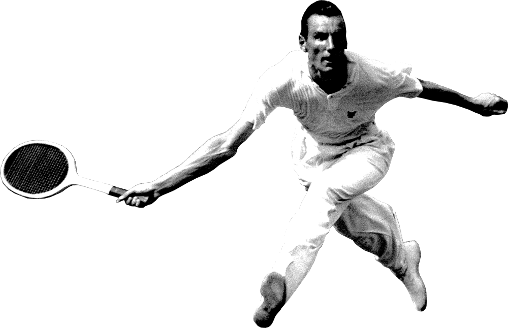
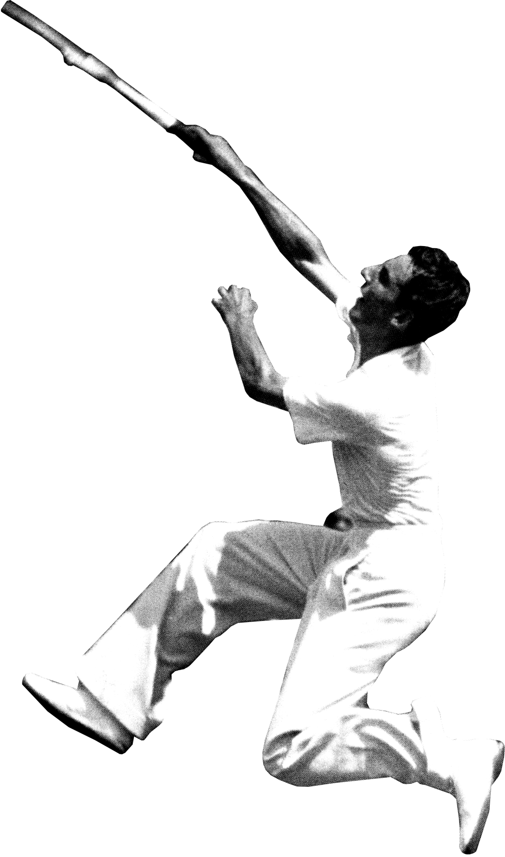
Adding an element of fun to the classic shots of Fred Perry playing tennis felt like the perfect blend of tradition and modernity. The dynamic movement in the imagery not only refreshed the window displays but also provided an opportunity to educate store visitors about the brand’s history and the origin of its iconic name.
Each image was hand-cut, scanned, and digitally altered to mimic the vintage editing style of printed media from the time. I wanted this approach to not only reflect the brand's rich history and the era of the images but also offer a subtle yet engaging way to connect with a modern audience. The image below is taken from the Manchester store.

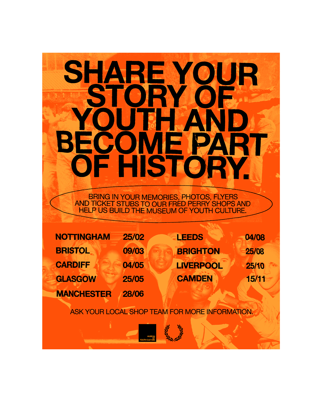
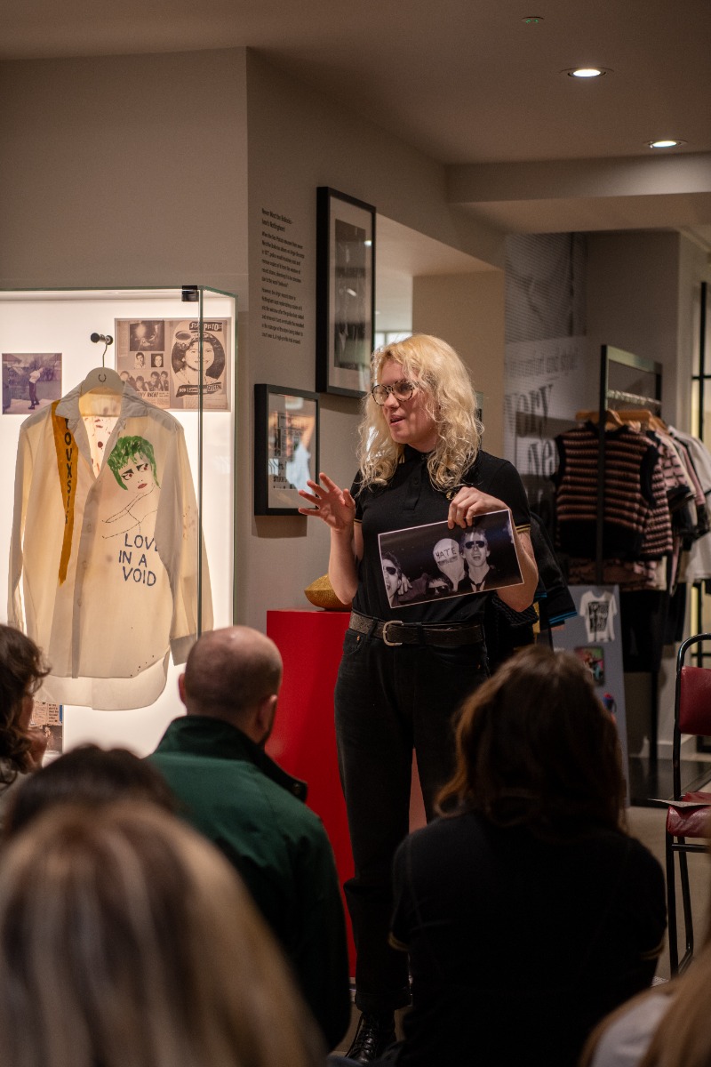
As part of Fred Perry’s long-standing partnership with the Museum of Youth Culture, I was tasked to create promotional assets for their nationwide tour. The tour aimed to spotlight local youth culture through in-store events featuring guest speakers relevant to each region. Alongside these talks, the Museum’s team invited the public to contribute to their growing archive by bringing in personal photos, memorabilia, and stories to be scanned and shared, celebrating everyday experiences and preserving youth culture across generations.
For the design, I aimed to capture the essence of youth culture from the 70s, 80s, 90s, and early 2000s, while incorporating a strong DIY aesthetic to reflect the spirit of the event. Each section of text was printed out and then hand-scanned to give it a raw, tactile feel. The background imagery was also hand-scanned (twice) to further reinforce the handcrafted, authentic nature of the design and tie all the visual elements together.


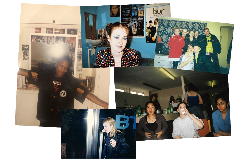
For Below are some collages I designed, using images from the MOYC archive. These were then added to go alongside an article for the Fred Perry website.


Below are images taken from the Nottingham MOYC store event in 2024.


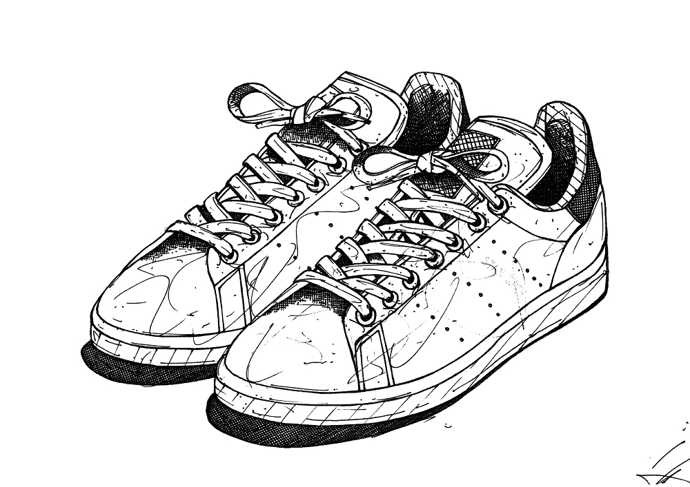
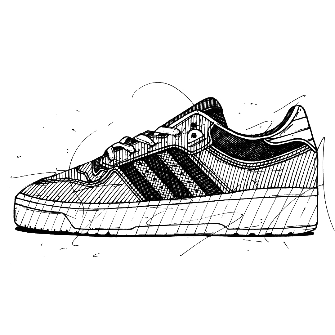
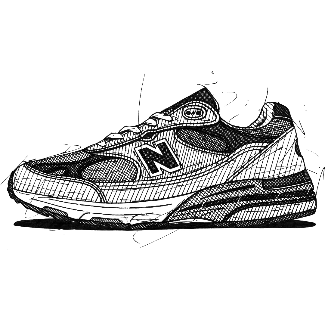
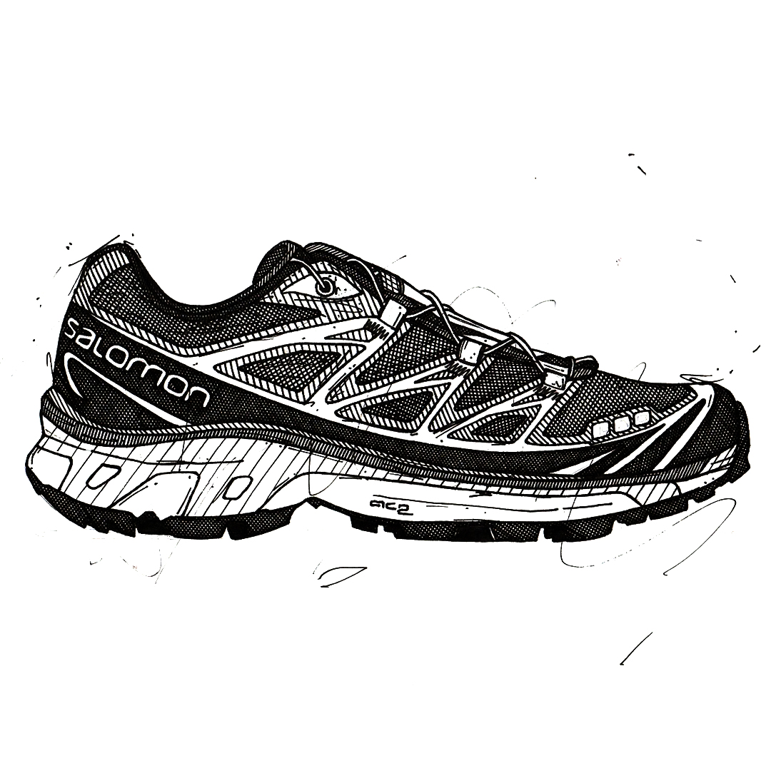
Hand drawn sneaker/shoe illustrations, all done using fine line ink pens x